Reusable React Code Modules, Part 2 - Styling and Components
Crafting Consistent and Aesthetic UI with Modular Styling and Component Libraries
Creating reusable styling and component modules in React is essential for building maintainable and scalable front-end web applications. This post provides an in-depth guide to achieving this, focusing on the most common libraries, tools, and techniques. We will cover practical examples and code snippets to illustrate how to create reusable styling and components.
Common Libraries and Tools
1. CSS-in-JS Libraries
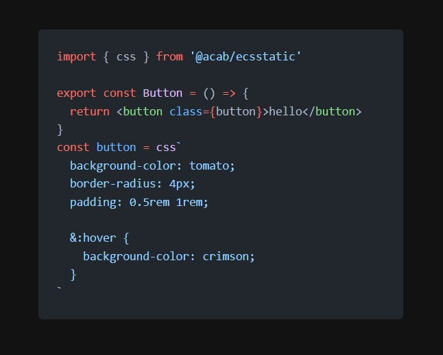
CSS-in-JS libraries allow you to write CSS directly within your JavaScript code, enabling scoped and dynamic styling. The most popular CSS-in-JS libraries include:
Styled-components
Emotion
JSS
Comparison
Styled-components: Provides tagged template literals, theming support, and automatic critical CSS extraction. Highly popular and widely adopted.
Emotion: Offers similar features to styled-components but with additional flexibility. Supports both string and object styles.
JSS: Focuses on generating unique class names for styles, making it less error-prone with more control over CSS output.
2. Utility-First CSS Frameworks
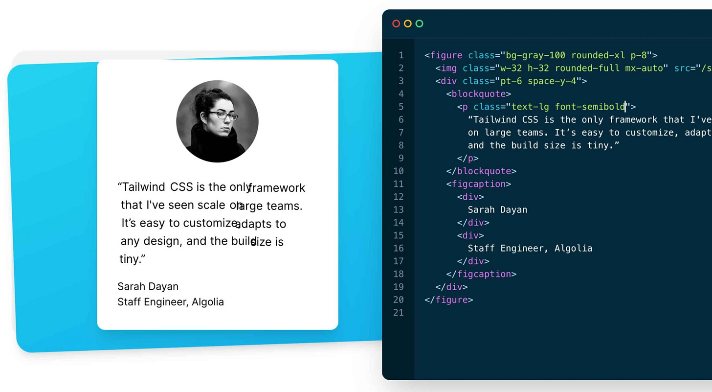
Utility-first CSS frameworks offer a set of predefined classes to build components without writing custom CSS. The most common utility-first framework is:
Tailwind CSS
Comparison
Tailwind CSS: Provides a highly customizable, utility-first approach, allowing rapid development without leaving your HTML. It can lead to a larger HTML footprint but promotes consistency and reusability.
Examples
Example 1: Styled-components
Button Component:
import styled from 'styled-components';

const Button = styled.button`
  background-color: ${(props) => (props.primary ? 'blue' : 'gray')};
  color: white;
  padding: 10px;
  border: none;
  border-radius: 5px;
  cursor: pointer;

  &:hover {
    background-color: ${(props) => (props.primary ? 'darkblue' : 'darkgray')};
  }
`;

export default Button;
Example 2: Emotion
Card Component:
/** @jsxImportSource @emotion/react */
import { css } from '@emotion/react';

const cardStyle = css`
  background-color: white;
  padding: 20px;
  border-radius: 10px;
  box-shadow: 0 4px 8px rgba(0, 0, 0, 0.1);
`;

const Card = ({ children }) => (
  <div css={cardStyle}>
    {children}
  </div>
);

export default Card;
Example 3: Tailwind CSS
Alert Component:
const Alert = ({ type, message }) => {
  const alertClasses = `p-4 mb-4 text-sm ${type === 'success' ? 'text-green-700 bg-green-100' : 'text-red-700 bg-red-100'}`;

  return (
    <div className={alertClasses}>
      {message}
    </div>
  );
};

export default Alert;
Reusable Components with Themes
Theme Management with Styled-components
Theming is essential for maintaining consistency across components. Styled-components provide a simple way to handle themes.
Theme Setup:
// theme.js
export const lightTheme = {
  primary: 'blue',
  background: 'white',
  text: 'black',
};

export const darkTheme = {
  primary: 'darkblue',
  background: 'black',
  text: 'white',
};
ThemeProvider:
// App.js
import React, { useState } from 'react';
import { ThemeProvider } from 'styled-components';
import { lightTheme, darkTheme } from './theme';
import Button from './Button';

const App = () => {
  const [theme, setTheme] = useState(lightTheme);

  const toggleTheme = () => {
    setTheme(theme === lightTheme ? darkTheme : lightTheme);
  };

  return (
    <ThemeProvider theme={theme}>
      <div style={{ background: theme.background, color: theme.text, minHeight: '100vh' }}>
        <Button primary onClick={toggleTheme}>Toggle Theme</Button>
      </div>
    </ThemeProvider>
  );
};

export default App;
Dynamic Styling with Props
Dynamic styling using props allows components to adapt based on passed properties, enhancing reusability.
Dynamic Button:
// DynamicButton.js
import styled from 'styled-components';

const DynamicButton = styled.button`
  background-color: ${(props) => props.bg || 'gray'};
  color: ${(props) => props.color || 'white'};
  padding: ${(props) => props.padding || '10px'};
  border: none;
  border-radius: ${(props) => props.radius || '5px'};
  cursor: pointer;

  &:hover {
    background-color: ${(props) => props.hoverBg || 'darkgray'};
  }
`;

export default DynamicButton;

// Usage
// <DynamicButton bg="green" color="white" padding="15px" radius="10px" hoverBg="darkgreen">Click Me</DynamicButton>


